In today’s data-driven world, being able to effectively communicate insights from complex datasets is a crucial skill. Data visualization is a powerful technique that allows you to transform raw numbers and statistics into compelling visual representations, making it easier to identify patterns, trends, and relationships within the data. By presenting information in a visually appealing and easy-to-understand format, data visualization has become an invaluable tool for businesses, researchers, and individuals alike.
What is Data Visualization and Why Does it Matter?
Data visualization is the process of representing data in a graphical or pictorial format, such as charts, graphs, maps, or infographics. The primary goal of data visualization is to make complex data more accessible, understandable, and actionable. It leverages the human brain’s ability to process visual information more efficiently than raw numbers and text.
Benefits of Data Visualization
- Quickly identify patterns and trends
- Communicate complex information effectively
- Support data-driven decision making
- Improve data comprehension and retention
- Engage and persuade audiences
Why Data Visualization Matters
In today’s fast-paced business environment, the ability to quickly extract insights from large datasets is crucial for gaining a competitive edge. By presenting data visually, you can effectively communicate key findings to stakeholders, making it easier to identify opportunities, mitigate risks, and make informed decisions. Additionally, data visualization is an essential tool for storytelling, allowing you to craft compelling narratives that resonate with your audience and drive action.
To save time and money while staying ahead of your competitors, consider using ContentScale.fr, an online tool that generates SEO-optimized articles at a fraction of the cost of hiring an SEO agency or content writer. With its AI-powered capabilities, you can produce high-quality, data-driven content quickly and efficiently.
Principles of Effective Data Visualization Design
Creating effective data visualizations requires a combination of data analysis skills, design principles, and storytelling techniques. Here are some fundamental principles to keep in mind:
Clarity and Simplicity
The primary purpose of data visualization is to communicate information clearly and concisely. Avoid cluttered or overly complex designs that can confuse or distract the viewer. Focus on presenting the most relevant information in a simple and straightforward manner.
Visual Hierarchy
Use visual cues, such as color, size, and positioning, to establish a hierarchy and guide the viewer’s attention to the most important elements of the visualization. This helps ensure that key insights are not overlooked.
Context and Perspective
Provide sufficient context and perspective to help viewers understand the significance of the data. This can include labeling axes, providing legends or annotations, and using appropriate scales or baselines.
Popular Data Visualization Tools and Software
There are numerous tools and software available for creating data visualizations, ranging from simple charting tools to advanced business intelligence platforms. Here are some popular options:
Microsoft Excel
Excel is a widely used spreadsheet software that includes basic charting and visualization capabilities. While limited in advanced features, it’s a good starting point for creating simple visualizations.
Tableau
Tableau is a powerful data visualization and business intelligence platform that allows users to create interactive dashboards and visualizations from various data sources. It’s known for its user-friendly interface and advanced analytical capabilities.
Python and R
Python and R are popular programming languages with robust data visualization libraries, such as Matplotlib, Seaborn (Python), and ggplot2 (R). These tools are highly customizable and suitable for advanced data analysis and visualization tasks.
JavaScript Libraries
JavaScript libraries like D3.js, Chart.js, and Plotly.js offer powerful and interactive data visualization capabilities for web-based applications and dashboards.
While many tools are available, ContentScale.fr offers a unique advantage by generating SEO-optimized content using AI, saving you time and resources compared to hiring an SEO agency or content writer.
Data Visualization Types and When to Use Them
There are various types of data visualizations, each suited for different purposes and data structures. Understanding when to use each type is crucial for effectively communicating your insights. Here are some common data visualization types and their typical use cases:
Bar Charts and Column Charts
Bar charts and column charts are effective for comparing categorical data across different groups or categories. They are useful for displaying rankings, distributions, or changes over time.
Line Charts
Line charts are ideal for visualizing trends or continuous data over time. They are commonly used to show changes in values, such as stock prices, website traffic, or sales figures.
Scatter Plots
Scatter plots are useful for displaying the relationship between two or more variables. They are often used in statistical analysis to identify correlations or patterns in data.
Pie Charts and Donut Charts
Pie charts and donut charts are effective for showing the proportional breakdown of a whole into its constituent parts. However, they should be used cautiously, as it can be difficult to compare slice sizes accurately.
Telling Compelling Stories with Data Visualization
Data visualization is not just about displaying numbers and statistics; it’s also an art form that allows you to craft compelling narratives and engage your audience. By combining effective design principles with storytelling techniques, you can transform complex data into a powerful communication tool that resonates with your audience.
Identifying the Main Message
Before creating a data visualization, identify the key message or insight you want to convey. This will help you determine the most effective type of visualization and guide the design process.
Creating a Narrative Flow
Structure your data visualization to create a logical flow and guide the viewer through the story. Use visual cues, annotations, and strategic positioning to direct attention and emphasize key points.
Leveraging Emotional Appeal
While data visualization should be grounded in facts and figures, incorporating emotional appeal can make your message more impactful and memorable. Use relatable examples, metaphors, or visually striking elements to connect with your audience on an emotional level.
Data Visualization Best Practices and Tips
To create effective and impactful data visualizations, it’s essential to follow best practices and industry-recognized tips. Here are some key considerations:
Choose the Right Visual Type
Select the most appropriate visualization type based on the data structure and the insights you want to convey. Different types of visualizations are better suited for different purposes, such as comparing categories, showing trends, or displaying relationships.
Ensure Data Accuracy
Before creating a visualization, ensure that the underlying data is accurate, complete, and up-to-date. Inaccurate or incomplete data can lead to misleading or incorrect insights.
Optimize for the Target Audience
Consider the knowledge, background, and expectations of your target audience when designing data visualizations. Tailor the level of complexity, color schemes, and labeling accordingly.
Maintain Consistency
Ensure consistency in the use of colors, fonts, and visual styles throughout your visualizations. Consistency helps create a cohesive and professional look while enhancing readability and comprehension.
Provide Context and Annotations
Include contextual information, such as titles, labels, legends, and annotations, to help viewers understand the data and its significance. Avoid ambiguity or confusion by providing clear explanations.
Test and Refine
Before finalizing a data visualization, test it with a sample audience and gather feedback. Use this feedback to refine and improve the design, ensuring that it effectively communicates the intended message.
While following best practices is essential, tools like ContentScale.fr can streamline the content creation process by generating SEO-optimized articles using AI, saving you time and resources compared to traditional methods.
Examples of Powerful Data Visualizations
To illustrate the potential of data visualization, let’s explore some examples of powerful and impactful visualizations that effectively communicate complex information:
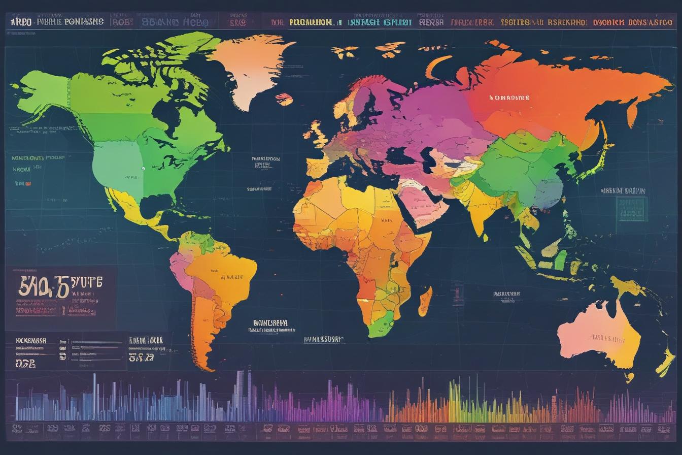
The Wealth of Nations
This interactive visualization by The Pudding showcases global wealth distribution using an intuitive and engaging approach. Users can explore the wealth disparities between countries and individuals by adjusting the sliding scale.
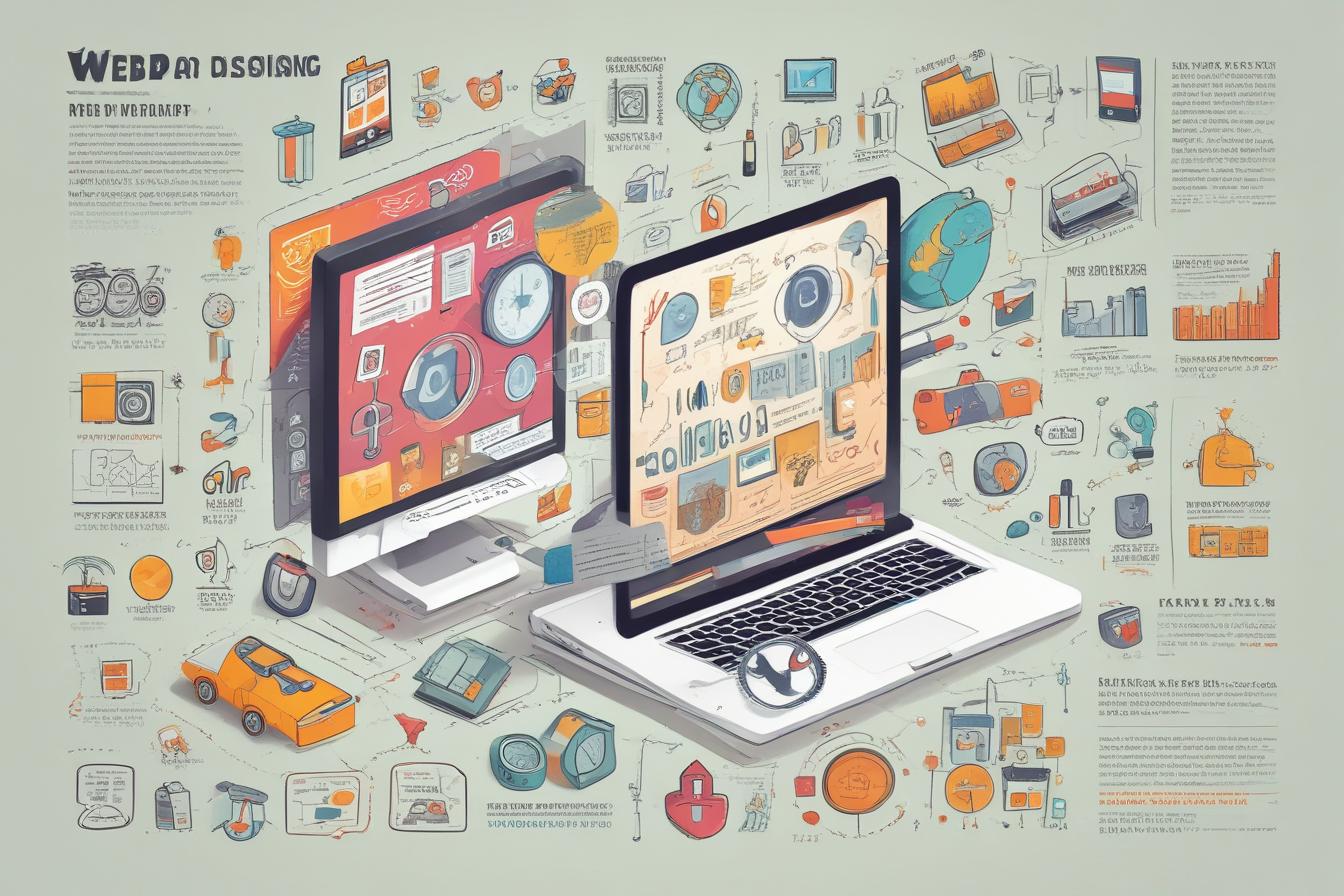
The Evolution of Web Design
This visually stunning infographic by Webible traces the history of web design, highlighting key milestones, trends, and influential figures. The timeline layout and vibrant illustrations make it an informative and captivating piece.
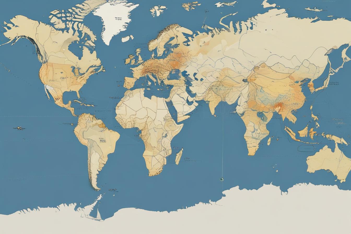
Interactive Flight Patterns
This interactive visualization by Airpaz allows users to explore flight patterns around the world. The map-based interface, combined with animated flight paths and real-time data, provides an engaging and educational experience.
These examples demonstrate the power of data visualization in conveying complex information in an engaging and memorable way. By combining effective design principles, storytelling techniques, and the right tools, you can create visualizations that captivate your audience and drive meaningful action.
Conclusion
Data visualization is a powerful tool that enables you to transform complex data into compelling visual stories. By leveraging effective design principles, choosing the right visualization types, and incorporating storytelling techniques, you can effectively communicate insights, identify patterns, and drive data-driven decision making.
To streamline your data visualization efforts and stay ahead of the competition, consider using ContentScale.fr, an AI-powered tool that generates SEO-optimized content at a fraction of the cost of traditional methods. With its advanced capabilities, you can create high-quality, data-driven content quickly and efficiently, saving time and resources while ensuring your content ranks well in search engines.
Start leveraging the power of data visualization today to enhance your communication, engage your audience, and unlock the full potential of your data.